In the good 'ol days of film (far back in the distant past around 6 years ago), you would shoot a roll of film, send it off to the lab and get back a batch of prints. Generally, if your local lab or Fotomat was competent, your photos would look pretty much as you'd expect them to.
But occasionally, things might go horribly wrong and Uncle Bob's face would be a sickly green. Assuming your film hadn't expired and old Bob wasn't really sick, the lab probably messed up while color-correcting your prints.
How could this happen? Doesn't film simply record the colors in the scene? The short answer is yes, but the actual color of any object is determined by the color of light that illuminates it*. An orange in sunlight reflects different colors than one in shade, or one lit by a light bulb.
Your brain "color-corrects" the scene for you, so you'll still see an orange that is, well, orange. But film simply records the reflected light, which might be tinted blue or red or yellow.
White Balance 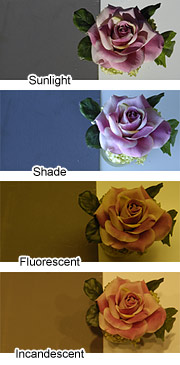
Digital cameras use light sensors that work in a similar fashion to film, so they also record colors tinted by the light source. But, as with most things digital, there is a bit of additional processing beyond the sensor. Much like the brain evaluates colors in a scene to compensate for the light source, digital cameras include automatic
White Balance (WB) to correct the color.
So, the color correction that was previously done by the film lab is now performed in your camera. No more green faces, right? Unfortunately, even the best digital camera can't match your brain or the skill of a color lab technician. It's fairly common for digital photos to have improper white balance, with a resulting overall color cast. (I find the most common issue when judging photos is a blue or cyan tint.)
The samples at right show the effects of ambient light on a gray card (at the left) and a flower when the WB is set to sunlight. Only the top ("Sunlight") is properly balanced and the gray card is actually gray.
Your job as a photographer doesn't end when you release the shutter. In the digital world, you need to also play the role of a lab technician and
process your images. This includes (but is not limited to) color correction.
Color Evaluation
It's been said that professional color management in digital photography is a "black art" and one could spend years becoming proficient at it. So let's start out by saying this is intended only as an introduction to the basics of color correcting your photos. If you're serious about accurate color reproduction, you'll need to begin with profiling your monitor** and learning about color theory, which we won't be covering here.
What we WILL cover is how to visually evaluate your photo and make basic color adjustments to correct for white balance (WB) errors.
Let's begin by looking at a couple of examples. Look closely at the photo below and then read on.
Now, hold your mouse over the photo and notice the difference. (You can go back and forth between examples by moving your mouse on and off the image.)
Notice that the corrected image is much warmer and natural than the original, but the difference only becomes obvious when you're able to compare them. Many people would look at the original and accept the colors as normal, but there are vital clues that can alert the photographer to a color error.
In this scene, the bright reflections off the flowing water have a distinct cyan cast. The corrected photo has proper white highlights in those areas.
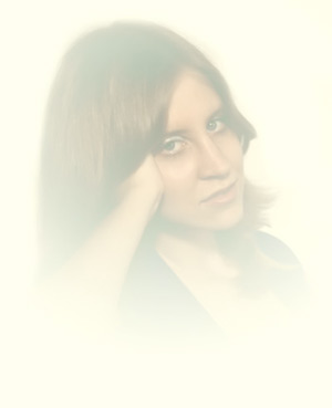
Let's try another photo, this time a portrait.

Again, hold your mouse over the photo to see the corrected photo. This is a good example of a shot taken in shade where the camera's white balance didn't correct for the cooler light source. In addition to a blue shift, her bright red hair appears dull and her skin is pale.
Identifying color errors in your photographs requires careful review and lots of experience, but there are some
techniques that will help.
- Look for color tints in areas that you know should be neutral, such as bright reflections off chrome, glass or water. Concrete buildings or asphalt roads are often neutral gray and will reveal color casts.
- In portraits, look for skin colors that seem pale, bluish, yellow, or magenta. Look closely at the whites of the eyes for a hint of blue or yellow.
- If a scene feels too cold, there is probably a cyan or blue cast. If it's too warm, check for a yellow or magenta cast.
- In landscapes, look for a tint in white clouds (which should be white of course), or a cyan rather than blue sky.
- For color-critical photos, place a gray card in the scene. This is simply a neutral gray (18%) card that you can easily evaluate for color casts during processing of the photo.
Color Correction
Once you have identified color errors in your photograph, you'll need to make corrections. There are various ways to do this (including working with RAW files that allow you to make direct WB adjustments), but we'll examine two basic methods.
To process your digital photos, you'll need photo processing software. Most cameras are sold with basic applications that allow you to process images, while many photographers choose more advanced tools such as Photoshop. Nearly all will give you the ability to adjust color balance.
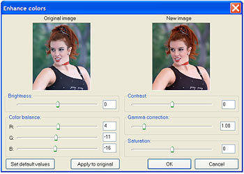
Adjust the Color Balance sliders (Red, Green & Blue)
to correct for color errors. Use minus amounts
to reduce a color
(or increase its complement), positive amounts to increase a color.
In the example above (with Irfanview, a freeware utility), color balance sliders are used to adjust the color. Adding RED will reduce a cyan cast (cyan is the complement of red), while subtracting BLUE would warm up the photo.
The key to color correction is to make small changes. If you push any slider too far, you risk "posterization" which is where colors in the image start to saturate and form large unnatural blocks.
Some photo processing software allows you to set a white point in the photo. This tells the program to use that point of color as a neutral reference and automatically adjust the entire photo to render that point as white or gray (with no color cast). If you choose a suitable point (in this case, the whites of the eyes), you can quickly and accurately correct the overall color.
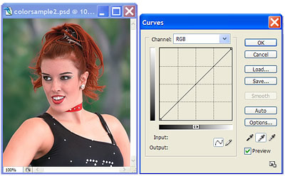
Using the Curves palette in Photoshop, you can choose a
white point or gray point (as in this example) to select a spot in
the photo
that should be neutral. Including a gray card in the photo
and using it for setting the gray point makes this method very accurate.
Learn to use all the color control features of your photo software and you'll quickly begin to see how adjustments in color balance can make your photos more lifelike and pleasing to the eye.
Mark Van Orden
8/9/2006
*
The standard unit of measure for the color of a light source is degrees Kelvin, which is related to the temperature of a heated object. As temperature rises, color changes from red to yellow to blue, so 5500 Kelvin (daylight) is more blue than an incandescent bulb (3000 Kelvin).
** Unless your computer display (monitor) is properly calibrated, you may not see the actual colors in your photos (or the ones pictured here) and accurate color correction is impossible.